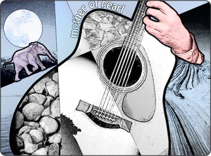
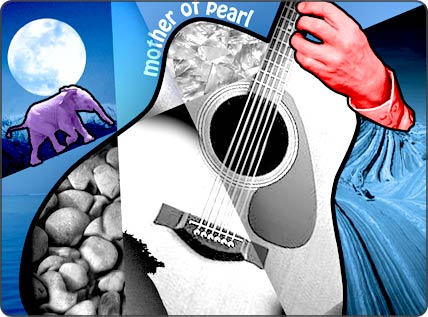
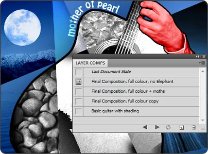
Artwork service: Album cover for my guitar album “Mother of Pearl”.
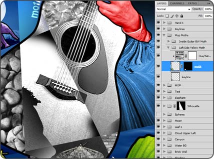
One of my great passions is Photoshop, I love to use it to generate artwork given the opportunity. This album cover was indeed created mostly in Photoshop – albeit with some text manipulation in Illustrator – and is composited from multiple layers and folders within Photoshop.
The album is a collection of instrumental acoustic guitar pieces, and the multi-textured guitar front is meant to reflect the multiplicity of textures and rhythms within the various pieces that comprise the work.
Non-destructive editing – for smoother workflow
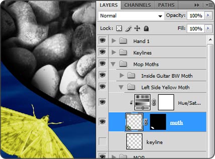
The Album artwork makes extensive use of Photoshop layers and folders, and also deploys the use of so-called “non-destructive” editing. What this means is that wherever possible, original pixels are retained, even if just on a separate own layer, so as to be able to revert back or try multiple different ideas within one piece by switching between layers, effects and adjustments.
There are a lot of advantages to working in this way, creative freedom to experiment is one of the key ones, but another advantage is that it smooths production workflow and makes updates a snip. The ability to go backwards to previous states within your artwork makes it really easy to update text, images and any other element in your artwork that might need to be retrospectively updated. Place-holder images can be easily replaced with the final hi-res equivalents, or elements simply moved around to suit art-directorial decisions.
Compositing is greatly aided when using Photoshop in this way. For example, the balance of elements within the overall composition was much easier to adjust for me when I used non-destructive adjustment layers to lighten, darken, colour enhance or desaturate. The underlying layer does not change in this scenario – and the adjustments can be endlessly tweaked or simply turned on and off for comparison at any stage.
Layer masks, also non-destructive, facilitate sophisticated compositions without the need to actually edit original pixels, providing far greater compositing power and flexibility.
Layer comps – the designer’s best friend
One of my favourite features in Photoshop is the Layer Comps palette. Basically, a layer comp is a snapshot of your current document – the layers selected, the position of objects within those layers and other settings.
Each time you reach a significant stage in your artwork or layout, you can save it as a Layer Comp.
Once you have several Layer Comps, you can easily switch between multiple different variations of a design concept ready for external review – either with an art director or directly with your client.
It’s really useful tool, a time saver and also a fantastic creative tool for trying out loads of different ideas.
![]()

