Always remember, web sites that look good and navigate well, feel good too…
And a website that feels good to use is far more likely to encourage users to do what you would like them to do.
This can be anything from making an on-line purchase, making contact with your call-centre, reading latest news, promoting a film – whatever the goal of your website is.

Horrendous design or great user experience? Or both?
Web designers look away. This site is an early version that supported the now infamous Borat movie. It looks as if it breaks just about every design rule going, but it is appropriate to the content, i.e. outrageously comedic, and is actually very user-centric.
However, to find out what your users really think, feel and do when visiting your site, perform user testing. To prove that your users have a great experience, one that encourages them to interact with your site and respond positively to your goals or calls to action, test for three major areas or considerations:-
1. Do users experience your site is user-friendly, easy to navigate and with minimal confusion? The golden goal of all websites is to avoid “bouncing” – that is, users taking one look at your landing page and then leaving immediately.
Assuming you have caught the interest of your user and they do decide to stay on your site, the next challenge is to give them quick, easy and enjoyable journeys through the site to your chosen outcomes or goals.
If you want users to come back again and again, and if you want them to perform repeat interactions and transactions, the easier you make it for them, the more likely the are to want to do this.
How the website is laid out, how intuitive the navigation is, and how clearly laid out the offer is, how easy the supporting information is to find, are all key design criteria that you need to harness to make your users’ experience rewarding and worthwhile.
2. Do users say that your site’s look-and-feel reinforces and focuses your brand? The look and feel is as important as the navigation, in that it has to be consistent with your brand message. Your logo, styling, images and typography make the user’s experience more memorable, and helps to differentiate your site from your competitors.

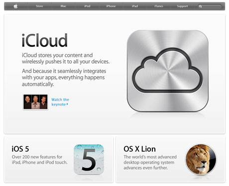
Clean, minimalistic design is consistent with Apple's distinctive branding
This does not mean to say your site needs to be overloaded graphics or other media, nor does it imply the opposite – a bare bones, minimalistic look and feel. The design must be informed by the brand and purpose of your site to ensure it looks and behaves in the way the user expects.
3. Do users experience the content of your site as engaging and reinforcing your offer? Now that we have so much user-generated content in websites, it is extremely easy to overlook the need for effective content design.
Even if you are commissioning a CMS driven website, effective content structuring, copy styling and the appropriate “voice” of your site all need to be defined and made consistent with your offer.
Without a professional hand, you may well end up with poorly considered or even irrelevant copy, which can give your users a mixed or confused message, reduce conversion rates, dilute your brand and ultimately drive your users away.
A further issue is that inconsistent copy writing and content design can wreck your page ranking, by confounding search engines such as Google and others, as they are particularly sensitive to copy and content that does appear to relate to the stated purpose of your site.


